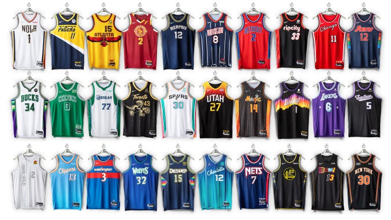

It’s that time again. On Monday, all 30 NBA teams released their respective Nike City Edition jerseys for the 2021-22 season. Because it is the 75th season for the NBA, the league also released the NBA Diamond Album, which is described as telling the “history of the league and each team, showcasing the NBA uniform behind every iconic NBA moment.”
The jerseys will be available on NBAStore.com on Nov. 15, but just because they aren’t for sale yet doesn’t mean we can dive deep and analyze what they all look like.
So now to the good part: judging the jerseys. I’m sure some people with disagree with my takes but hey, no two sports fans will ever have the exact thoughts on 30 uniforms.
To break it down I will section it into the good, the bad and the very ugly. Apologies in advance if your team ends up in that “very ugly” category.
The Good
- Dallas Mavericks: The cowboy hat is perfect for a Texas team and it gives off an old school feel, which I enjoy.
- Cleveland Cavaliers: This is another jersey that nailed that old school feel without trying too hard.
- Charlotte Hornets: The vertical stripes almost made me put it in the bad category, because they aren’t executed as well as the usual stripes, but I like the colors and the beehive reference so it stays in the top category.
- Atlanta Hawks: A hawk grabbing a basketball? I’m in.
- Brooklyn Nets: The simplicity of this one, as well as the callback to the franchise’s days in New Jersey, works for me.
- Detroit Pistons: I would’ve preferred bigger numbers, but the shorts on these ones are fun.
- Indiana Pacers: I can see the nods to the past without it being too obvious.
- Memphis Grizzlies: I appreciate the ridiculous attention to detail in these uniforms.
- Minnesota Timberwolves: I was almost out on these, but they’re fun so I’ll put them in the good pile.
- New Orleans Pelicans: The nod to NOLA and the details are a nice way to bring in the team colors in a classy way.
- Portland Trail Blazers: The Ripcity reference is appreciated and the lettering looks clean.
- Philadelphia 76ers: These are the perfect blast from the past and also incorporate the teams of the city.
- Washington Wizards: These aren’t too crazy, but still do a good job of giving that throwback feel while not going too far from their usual style.
- Toronto Raptors: I love the old Raptors logo, so I’m a fan of these.
The Bad
- Chicago Bulls: I see what they did here and I don’t really hate it, but I’m just not “wowed” so it misses that good category.
- Golden State Warriors: These jerseys look like a mix between their regular ones and the Los Angeles Chargers jerseys.
- Denver Nuggets: I appreciate their push for creativity, but it just seems like they are doing a bit too much.
- Houston Rockets: These jerseys remind me of a bowling shirt. And not in a good way.
- Miami Heat: Oh Miami, this was just not necessary and looks like back in the day when I’d cut out letters magazines for projects. This feels very rushed.
- Milwaukee Bucks: These are just OK, the collar looks like antlers, which is cool, but otherwise I’m not too impressed.
- New York Knicks: Once again, I’m just not blown away so I can’t sit here and put them in the good section.
- Orlando Magic: The two star is too much, the color scheme isn’t my favorite and the gradient on the side is outdated.
- Sacramento Kings: I could’ve gone for other nods to teams of the past, though they aren’t the worst.
- San Antonio Spurs: These city edition jerseys … don’t have the city’s name on them and they are not getting the most love from fans.
The Very Ugly
- Oklahoma City Thunder: These are just … not it at ALL. I don’t know what they were doing here, but it did not work.
- Boston Celtics: C’s, why can you never create a decent alternate jersey? These are no fun at all.


